
Look at your website - how many conventions does your site ignore?
In our previous blog 'Applying psychology to web design' we looked at why the aesthetics shouldn't dominate how a website is designed.

There's a lot of science out there telling us how we interact with websites. Some interactions are more subliminal than others.
Psycho-Elf thinks it's worth noting what these subliminal cues mean since they will direct the visitor around the site and if you get it wrong, you'll potentially lose that visitor. Cognitive overload and a lack of intuitive navigation really do impact on the success of your site.
Check out these common errors in web design and see if any apply to your site...

Contact us?
Surprisingly, research suggests that this crucial piece of information is still absent on many websites.
Advertising your phone number is the first step to establishing trust between you, your business and your visitor and by not making this visible you're not giving the impression that you're a company to be trusted. As Psycho-Elf pointed out in her previous blog - first impressions DO matter.
Contact details should be visible in the top right hand corner as per web conventions. There are still sites out there that have the link to the phone number/email in the footer - too many steps and not enough visibility!
And whilst we're on the subject of trust, don't ask for a visitor's email address up front. If you haven't solved a problem or offered a lead magnet (we talked about these in 'Blogging: How do I include a blog in my marketing strategy?') then you've created a negative impression in seconds.
Navigation's what I mean
With mobile devices now generating more global web traffic than desktop and tablet interfaces you can see why certain design features are falling by the wayside.
Psycho-Elf is here to ask you to apply some self-restraint and design for both mobile and desktop. If you've got the page space for your desktop version, use it. There's really no excuse for omitting a navigation bar - it's what users expect and there's nothing worse than invisible navigation.
The 'hamburger' icon is fine for mobile browsing but not great for desktops. And whilst some designers have opted for vertical navigation to shake things up a bit, these are generally placed on the right hand side. Oh dear - that's where users expect to find ads and will probably ignore them!
Navigation: horizontal, along the top where the eye will naturally rest and your visitors will feel more at ease.
One more thing: we've already pointed out the navigation over on the right hand side is synonymous with ads. Avoid moving sliders and rotating banners on your site. Users generally treat them with disdain and deem them irrelevant.
And "Action!"
Too many websites signpost their CTAs poorly.
A great button is useless without a description and it needs to stand apart from the rest of the web page.
Look at your CTA button objectively:
- Does it grab attention?
- Is the button in the right place?
- Does the colour contrast with the rest of the page's theme?
- Is it hidden as the background is too cluttered?
In a video by Neil Patel (web guru) he looks at how to improve CTA conversion rates and it starts with colour.
Think about the location of the CTA - above the fold is prime 'real estate' - below the fold is not where the CTA should reside.
Sky's home page demonstrates these points well - The £39 offer stands out from the rest of the text and the CTA button contrasts well with the background and the image. There's a lot of white space around the promotion but anything else is going to detract from the main message.
Incidentally, the home page complies with convention: horizontal navigation along the top, search box on the right and the logo is top left. Sky is a household brand and could deviate from the norm - but doesn't.
To further emphasise the point that the design is text-book, the images below the fold follow a different layout to keep the visitor interested.
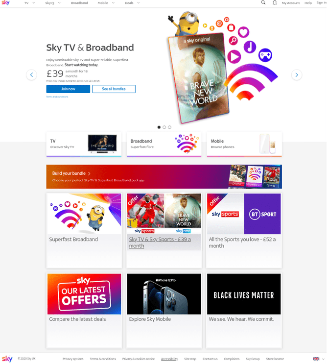
Image is everything
Now, we can all be blown away by a beautiful image and certainly, Psycho-Elf encourages the use of imagery to attract attention to what you're trying to promote and will also give the eyes some rest time.
Be mindful of using one image on the page if it makes the message appear cluttered or even invisible. You'll notice with our web pages we have one image which dominates but it doesn't override all the information we want to display. The tagline, contact info and navigation is still clear.
Check out the 'Monstrous Images' section of the sitetuners.com blog which demonstrates just how badly an image can impact upon a website.
Logos and no-no's
Consistency is key here. If your site design is off-piste and you've placed your logo in the centre of the page have you given thought to where it sits elsewhere in the site? Click on other pages and the logo is slap-bang in the middle of your eye line and it's probably going to look odd.
As we've said before, users expect the logo to sit top left and by clicking on it you'll return back to the home page. These are givens and you'd be daft to ignore them.
Give some thought too, to where you want to place your products. A very thorough blog on the usabilitygeek.com site suggests that where your products are promoted on your site influences what action shoppers will take. Place the product you want purchased the most either first or last.
Also bear in mind the difference between short and long term memory - we're more likely to remember products at the end of a sequence - what's known as the recency effect.

The font of all knowledge
We discussed in our previous blog 'Applying psychology to web design' how fonts can convey various emotions. Be mindful of the font you actually choose to adopt for your website. The bubble writing of the 1970s sure makes us nostalgic for the decade (Psycho-Elf remembers Crystal Tips and Alistair for goodness sake) but how dated would your website look using the designs now? Unless you're into a retro 70s, groovy vibe then avoid or else your website will reside in a time warp.
The size of the font is important too - the headline font needs to be big enough to jump out of the page. If your readers are squinting to read your content, they won't be staying around for long. The consensus is that headline size should be 41px and body text 16-18px - and remember, different fonts come up in different sizes.
Ensure your font colour contrasts with its background. Sounds like common sense you say. There's a reason why books are printed with black font and a white background. Err, it works.
Avoid long lines of text since users find this style of layout intimidating. As a general rule, stick to 65 characters per line.
What have we learned?
So what can we take away from this blog?
Well, Psycho-Elf has certainly told you what you shouldn't be doing and longs for the days of The Banana Splits...
One of the key tips she's taken away from all the reading is that the approach needs to be sound from the start. Build into your design what the basic conventions of websites are. If you have all your content confirmed that's brilliant - include the content now before you get carried away with the various layout options you want to try.
The fundamentals need to be there - get your images right, contrast any CTAs with the background clearly, do include navigation and make sure your contact details are clearly visible.
Our next blog will guide you through the tools available to build a great website.
If you'd like us to audit your site now or want to discuss a new site in more detail, please contact sarah@digital-doctor.co.uk