
Curious Elf was reminiscing this week, daydreaming of a time when car journeys involved a holiday rather than the unexciting weekly food shop. Cast your mind back to being loaded into the back of a car whilst you were still half asleep in your polyester quilted dressing gown (nice) and squabbling with your sibling about whose head was going to get the middle armrest. The journey was endless (cue wistful sighing) and tedious (oh the joy) and the only game that kept your attention was identifying the logos on the front of cars as they drove past you on the motorway (yes, the M3 had just opened by then).
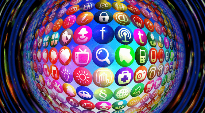
Well all this soul-searching led to a ponder about logos and how we are now literally swamped with logos, icons and branding at every turn, swipe and click. How do we manage our capacity to retain our recognition of all these images and what makes a logo a great one?
With the increase in new startups, more founders are seeking out a unique brand and identity.
Curious Elf has looked into the laws of the logo - from what makes a great one to the key principles in designing one.
The startup's guide to the laws of the logo
So your business bean is germinating from a dream to reality and you want a great logo which will encompass your story, your brand, your identity and your product. But where do you start? With many marketeers citing that the average consumer is bombarded with over 5,000* brand messages per day then designing a logo which distinguishes itself from its competitors is no easy task.
The first law is the KIS law: Keep It Simple.
The second law is the 3 second law: You have a minute amount of time in which to capture attention.
The third law of bond: The logo must resonate with the consumer you're trying to attract.
In a great blog by Venngage it's a good idea to establish your brand vibe and by this we mean what feelings do you want to convey to your demographic? A memorable logo will instil an emotion or convey a message about your brand - are you happy, professional, reliable, fun, peaceful?
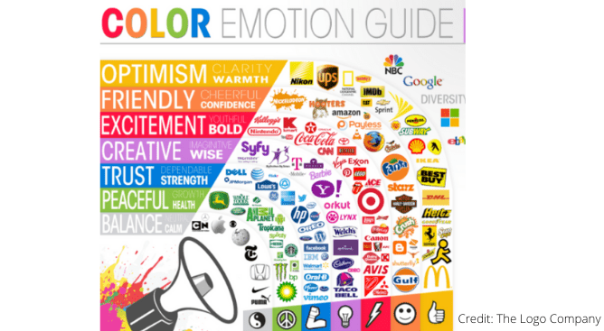
Digital Doctor's previous blogs have looked at the psychology of web design and Psycho Elf told us about the use of colour in design and the feelings different colours can invoke. The Logo Company's image below provides an informative overview to illustrate the theory when applied to logo design.
*Yankelovich market research body
The first task then, is to come up with 3 to 4 words which describe your brand vibe. How do you want people to feel? Identify the feeling(s) and you're closer to choosing a colour scheme. Venngage then lists their top 10 design tips:
- Choose simple icons - pictures convey a story more quickly than words.
- Be brave and use visual puns.
- Employ plenty of empty space in your design - a logo needs to be recognisable in an instant and at a distance.
- Applying clever use of shapes can give you more leeway in how you include any text.
- Consider where your logo will be seen - on merchandise, brochures, business cards?
- Apply the monochrome principle - simple but effective and can be 2 colours which enhance each other - you're not limited to black and white here.
- Choose the right font for the right message (and our blog 'Applying psychology to web design' discusses this).
- Limit the use of colour for maximum effect (Amazon's logo is a good example).
- Don't reinvent the wheel at the expense of understanding what your product is all about.
- It's acceptable to re-jig your logo over time - just be mindful of not changing it completely.
Medium.com's The Startup whittles the wish list down to 4 key points:
1. Function and Purpose - how can your logo define your product in the most minimal way but at the same time differentiate you from your competitors?
2. Quality - a successful logo is one that can be replicated from memory (and in a world of brand overload, this task becomes more tricky).
3. Structure - a great logo will be balanced and symmetrical whilst still being unique.
4. Founder vs. Designer - it's important that as founder of the business bean you emotionally buy into the logo. It's important that the designer hasn't forced a logo you dislike onto you.
And remember - a logo doesn't always need to explicitly say what the business does to be successful. A little bit of ambiguity will create buzz purely because human behaviour seeks out novelty and an unusual logo will pique our curiosity.
And the top logos of all time?
One thing's for sure - there are plenty of top 10s, top 20s and even top 50s of what makes a great logo.
Curious Elf could list many logos which have been cited in various countdowns but we'll signpost listings from several design agencies. Very often these listings come with a history of how the logo came to be and make for an interesting read.
Creative Bloq give us a top 10 - with FedEx topping their list. How many of us have spotted the right-hand arrow within the text? Curious Elf hadn't.
The logistics giant also features in 99design's top 10 and they suggest the use of the arrow conveys movement and precision. FedEx also incorporates colour into the logo to represent various areas of the business. If your business also has a number of strands, 99designs gives that particular design feature the thumbs up.
Google's logo makes it into 3rd position in 99designs. The use of bright and bold colours instils a feeling of fun and by changing the logo to represent various local and world events, the brand becomes relevant and in touch with us on a weekly, if not daily basis. eBay uses similar colours to Google, again, making the brand fun and dynamic. Overlapping each letter suggests a sense of community.
We have a compilation of 21 'Most recognised brand logos of all time' from iMPACT - from Google to Starbucks via Disney and Microsoft, Brett Casella argues that these logos would be recognisable even if half the logo were missing. There are 3 common themes which can apply to these logos: unmistakability, consistency and simplicity.
Canva's listing of 50 logos is comprehensive and provides a back story to each.
Curious Elf is getting the hang of this now and poised, ready to design her own logo now she understands the principles and meanings behind each one.
What are the logo design trends for 2021?
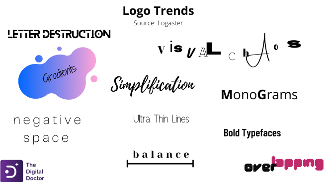
Well yes, we're already into 2021 but Curious Elf was curious enough to look at what the designers have predicted for this year. A blog from design agency zenbusiness gave us 10 predictions and we've put this into an infographic to provide an overview.
We're looking at chaos vs simplicity, thin lines vs bold fonts, clean, negative space vs letter destruction (so long as the words are still legible).
In a nutshell, we think the predictions tend to contradict each other - so everyone is happy!
What have we learnt about logo laws?
Curious Elf could have gone into the technicalities of design - she could have emphasised that your logo must be scaleable, must come in various colour formats (inverted versions should also be checked out for example) and have more than one shape orientation. She won't bore you with the file formats your designer should produce the logo in, nor the colour references which exactly match your logo so it can be replicated for printing purposes. If you are interested in these complexities then you can find a good overview, 'Logo design mistakes and how to avoid them'.
Take away from our blog the key message of Keep It Simple. The most successful logos have one thing in common - and that's simplicity.
Does the logo stay in your memory? Can you replicate it from memory? Is it unique? According to Business Insider, the golden arches of the McDonald's logo are more recognisable globally than the Christian cross.
Some of the most effective logos are those without text - this may have evolved over time as brands have become more familiar to their consumers but consider the likes of Shell, Apple and Mercedes-Benz - these logos have neither words or letters to underpin the product - we just know.
Finally, to stress an important point: if you're the proud parent of your business baby then make sure you feel emotionally attached to your logo! It's part of you!
If any of this blog has stimulated some thoughts then Curious Elf suggests you contact sarah@digital-doctor.co.uk. You'll be able to talk through your business mission, convey your vision and we'll do the rest.